A strong brand strategy is the foundation of a great brand visual identity, here’s how I fell in love with mine.
There is a lot of bias there, but hear me out. When a brand is right in every way and you genuinely believe in it, you should be smitten.
When I set out to start my own practice, I took myself through the same branding process I use with clients. Partly to test it. Partly because I couldn’t, in good conscience, ask others to go through it without doing it myself. I had to answer all those tricky, thought-provoking questions. And also because I had a very talented creative in mind to design my visual identity. I knew if I turned up without the answers, he’d toss my brief straight back with a look of disdain and ask, ‘Have I taught you nothing?’.
The process is where the love affair began
One part involves gathering audience insights, so I spoke to people I’d worked with. The conversations were gold. They confirmed what I believed about my own philosophies and helped me shape what I wanted the practice to stand for. It also gave me a chance to look at my Jahari window. What came back was so encouraging and energising, it put a spring in my step and left me buzzing with optimism. I could see where the brand could go and all the possibilities ahead.
By the time I briefed the visual identity, I was fired up. Enter David Bardell: friend, mentor, colleague, creative partner and a few other titles depending on the day. The guy who sees all my quirks and still agrees to work with me.
A few days later, he rang and asked a string of random questions:
If Wric were an animal, what would it be? A lioness.
Favourite fruit? Peaches.
How does Wric stay ahead? We read, learn and stay curious.
How do you work? Collaboration.
What do you love most about your work? The research.
What takes up most of your time? Talking and writing.
Where would the best conversations in your office be held? Sofa.
“The lioness and peaches are interesting. I didn’t rest. OK. Bye”
And just like that, he was gone. I wondered what he was cooking and left it
He was gone, gone. Three weeks of radio silence passed. Then, ping! A file had landed in my inbox.
Disclaimer: The timeline was, let’s say, fluid. The brand only went live nine months after that email. But let’s not get distracted.
Back to the file. The first page had the question: How do we express a brand for a business whose founder is both flamboyant and matter-of-fact? It was written in two shades of green. I smiled at the question. Frowned at the colour. Green, David? Then I remembered, I trust David and I trust the process. I flicked to the next page.
More questions.
Then, page three: four words in orange, tucked underneath a short paragraph. I was intrigued.
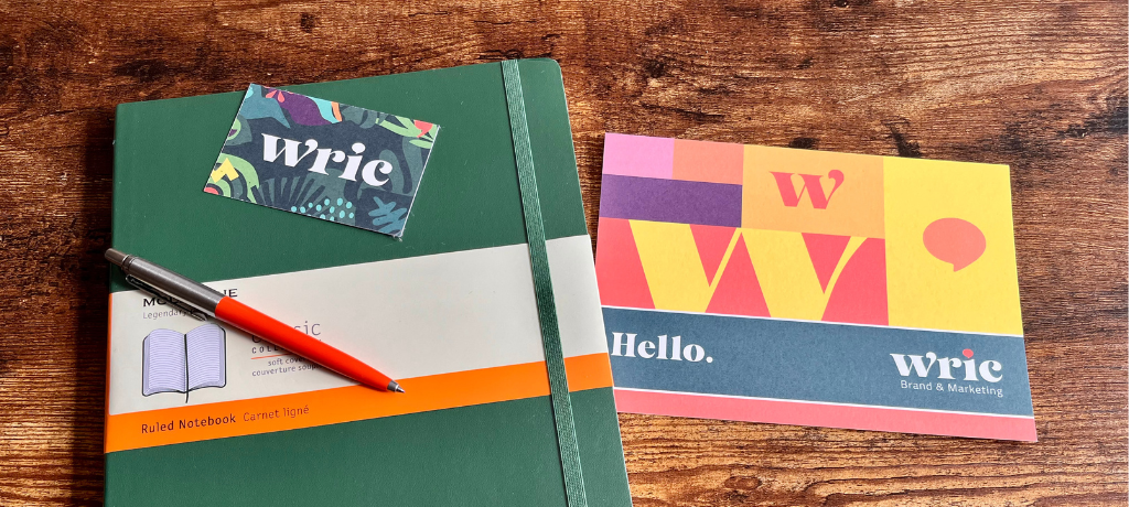
Page four: the logo. My eyes widened.
Ten pages in, I was totally on board. And surprisingly OK with green.
Now, green was not a colour I would ever have chosen. For anything. No clothes, no accessories, not a scrap in my house. It definitely wasn’t on my brand mood board. But there it was, making sense for my business. No pitch, no presentation, no explanation or hard sell. I’d drunk the Coolade and I was chugging it. It just worked. In fact, it worked so well, there were no amends, no “Can I see another version?” Approved at first glance.
We’ve been working on our website, and I have to say, seeing how it’s coming to life – the storytelling, the tone, the look and feel – I feel an incredible sense of pride. Everything about the brand brings a smile to my face. I’m smitten all over again.
And the Coolade?
Well, let’s just say I now own green notebooks, handbags, a laptop case, an iPad cover, desk accessories, a pencil case and probably more!
Turns out, green suits me just fine.